Chart Appearances
Chart Appearances: This video contains how to modify chart appearances of chart in OPNBI.
tip
Only users with Dashboard privilege have access to this section!
Read 5 minutes tutorial here.

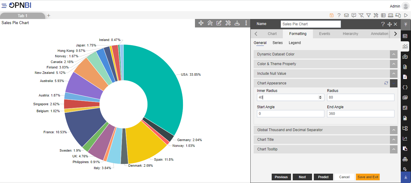
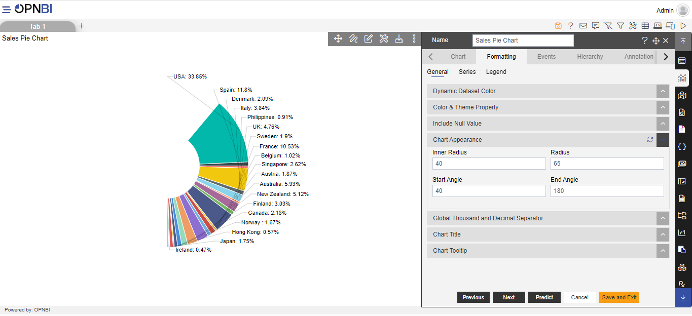
Inner Radius: It enables the user to make changes to the space radius inside the pie chart by increasing or decreasing the value of inner radius in the pie chart.
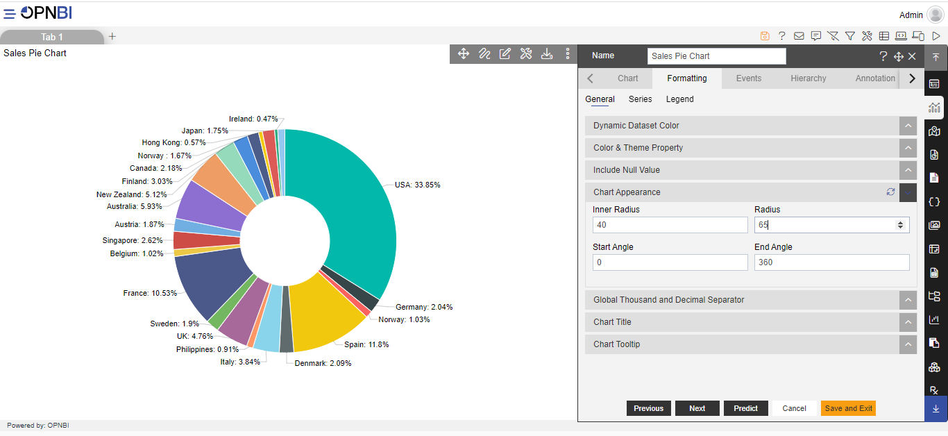
Radius: It enables the user to make changes to the radius size of the pie chart by increasing or decreasing the value of the radius size of the pie chart .
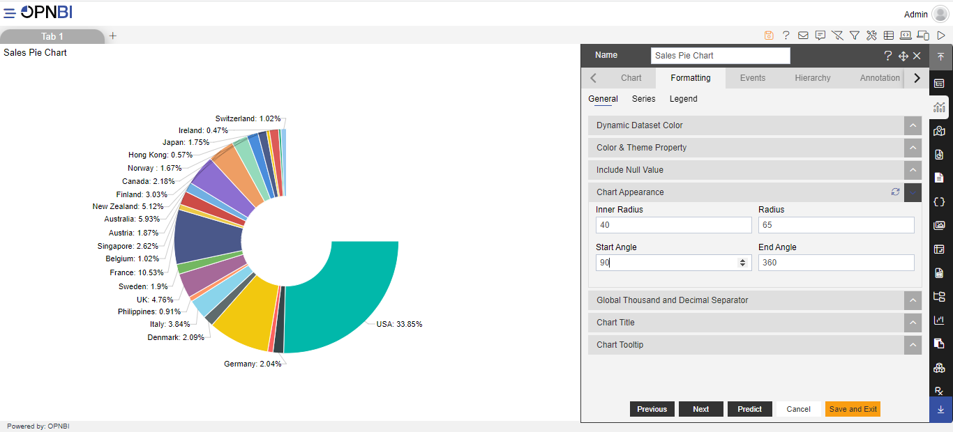
Start Angle: This angle used to give a size space to starting angle of pie chart, the total angle that corresponds to the entire data set is 360 degrees, which is equal to one whole pie chart. by default, its 0.
End Angle: The end angle used to control angle of pie chart from the ending point of the pie. The entire data set is 360 degrees, by default its 360.
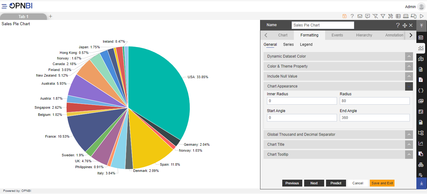
Default dashboard With Default Chart Appearance:
- Adding inner radius:
- Reducing radius:
- Adding Start Angle:
- Adding End Angle:
To know more about other formatting properties click on below links:-